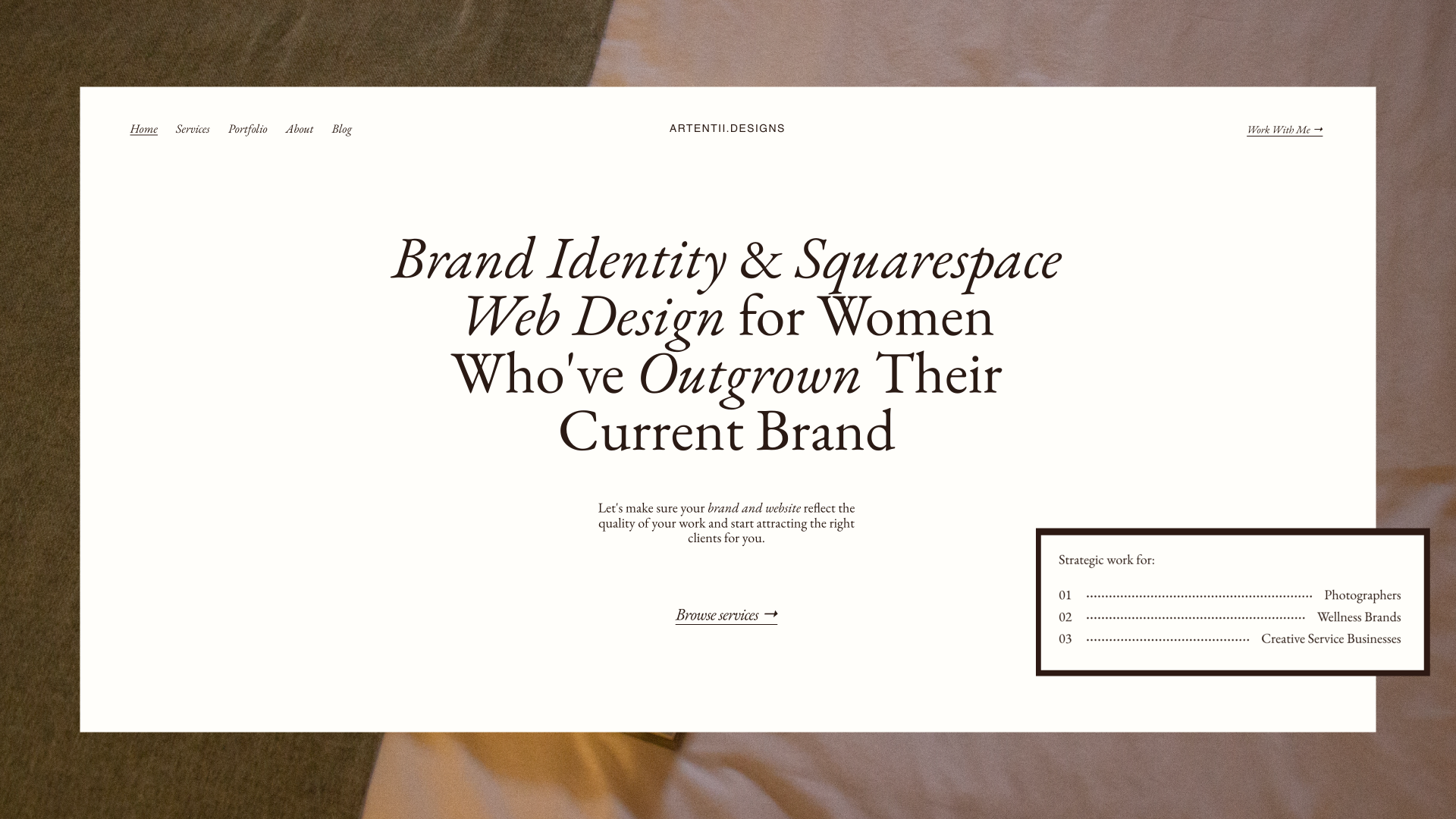
6 Squarespace Website Improvements That Got Me +90% More Views in 1 week
For a while, I told myself the traffic was encouraging.
People were finding me. The numbers were going up. I'd refresh Analytics and feel a quiet kind of optimism… it's working, it's building, it's just a matter of time (me writing this like … I know… you’re so naive Marina).
But the inquiries weren't coming. And self-doubt invaded me. Eventually I had to be honest with myself: views aren't bookings. Something was breaking the trust before anyone got close enough to reach out.
So I had to stop guessing and do the hard work, took my pencil, an XXL iced latte, and started taking notes. I went deep on SEO, conversion, UX, and copywriting, not because I wanted to become a marketer (believe me… I’m not even close to call myself that), but because I realised that a beautiful website that doesn't convert is just an expensive portfolio that no one books from.
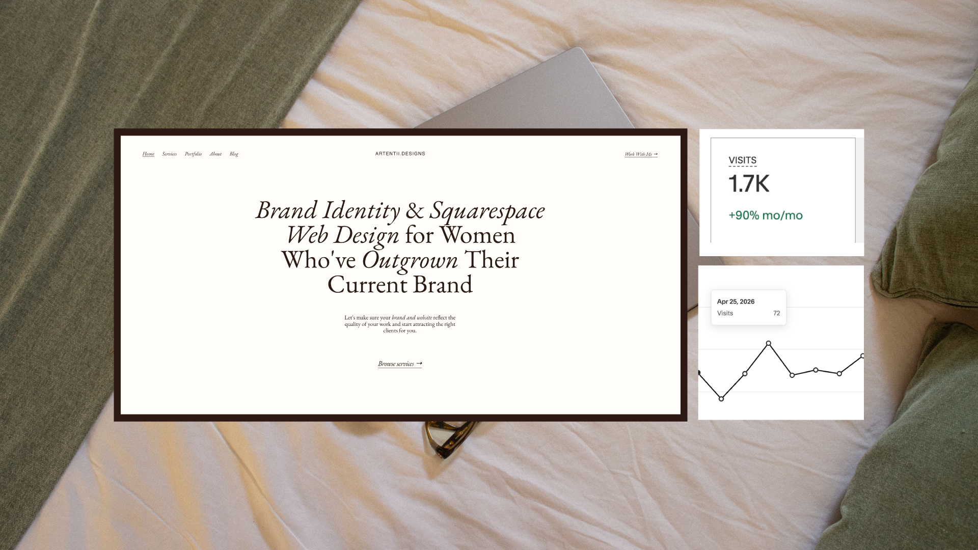
One week later my site views were up by +90%.
Here's exactly what I did and how you can apply it to your own site today (take notes because there’s good stuff you need to do for your site RIGHT NOW).
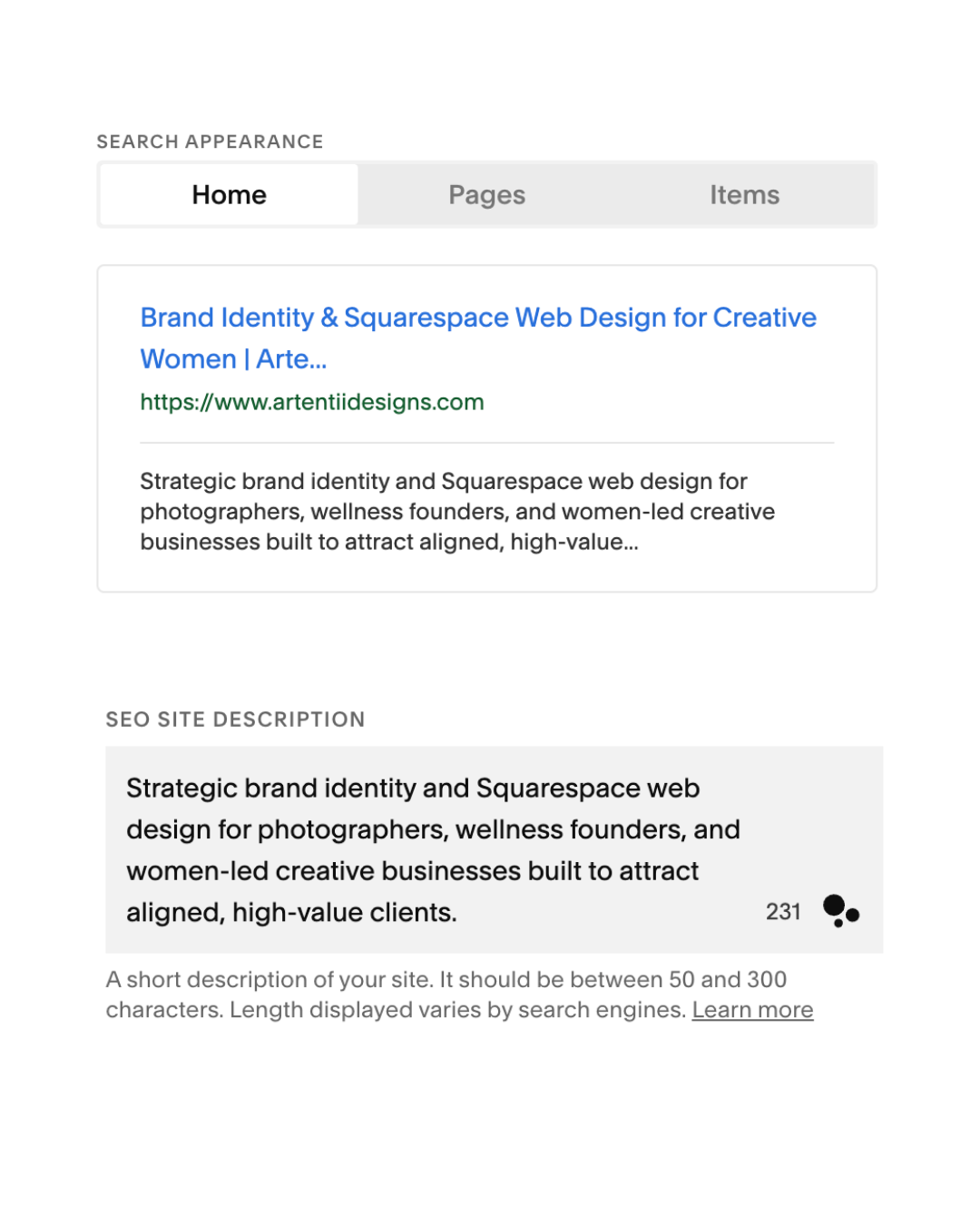
01. I rewrote my meta titles and descriptions to actually mean something
My meta descriptions were AI-generated (oh, what a surprise huh?? thanks Claude). My old meta descriptions were vague. Words like unique, premium, and creative solutions mean nothing to Google and even less to the person searching for help.
SEO isn't glamorous.
It's not the part of website building that feels creative or expressive.
It's the foundation that everything else sits on.
If Google can't read your site clearly, the right clients never even land on it. They find someone else… probably someone with a less beautiful (because your work is gorgina seeeesh) site who just did the basics better (sorry, I know it hurts).
I rewrote every meta title and description to be specific, keyword-rich, and useful. Instead of creative brand designer, I wrote strategy-first branding and Squarespace websites for women-led businesses.
What to do: Go into your Squarespace SEO settings and rewrite your meta title and description for every page. Be specific about who you help and what you do. Include words your dream client would actually type into Google.
02. I fixed my image alt text and compressed every file
My alt text used to say things like logo design or brand mockup. Descriptively, is accurate. But it tells Google nothing about who I am, what I do, or what this image is actually showing in context.
Alt text is one of the small (overlooked) places where SEO and accessibility meet. It's how screen readers describe images to visually impaired users, and it's how Google understands what your images contain. When every alt text on your site is generic, you're leaving discoverability on the table.
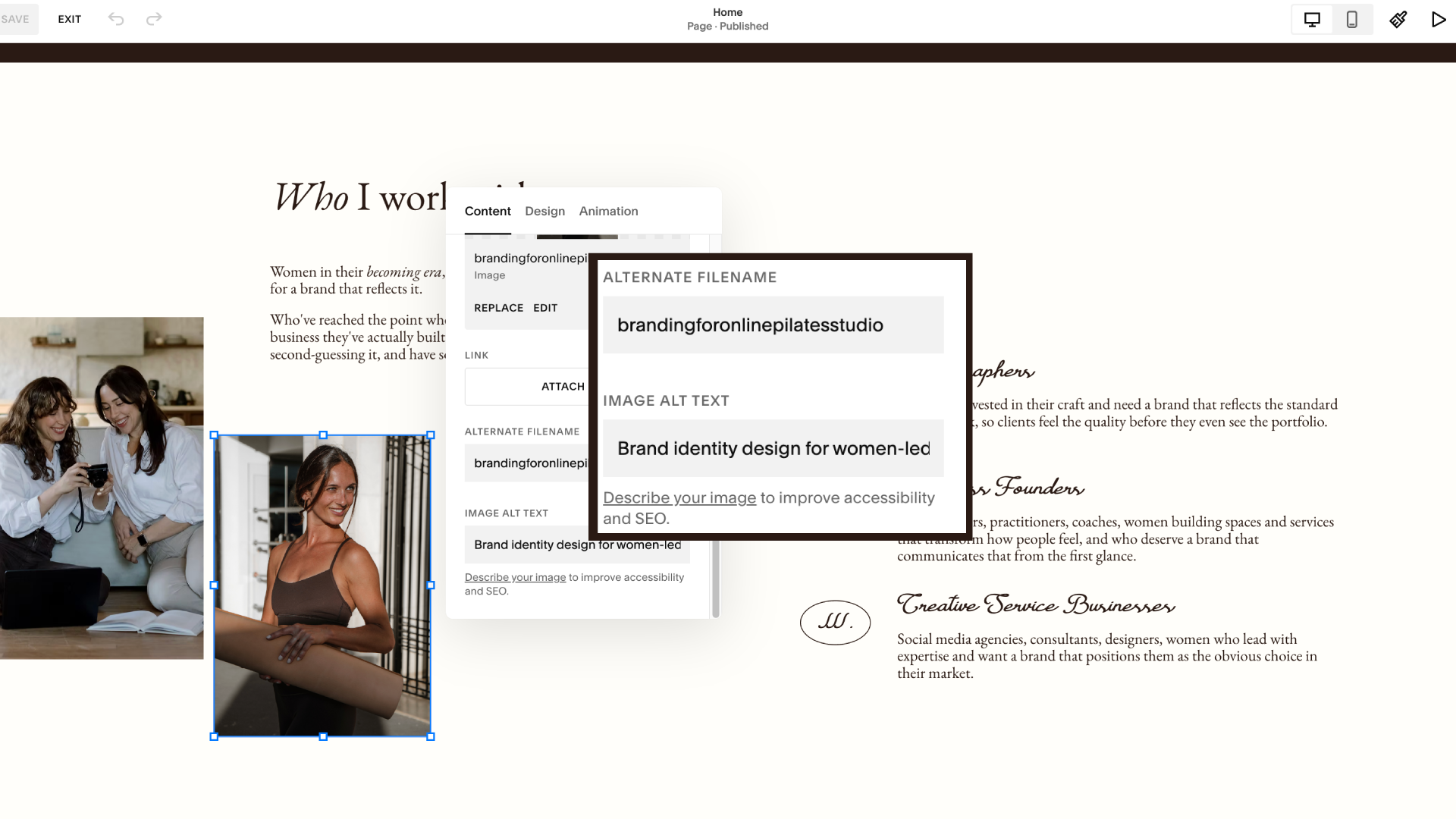
Now they read more like: Squarespace website for Squarespace, a pilates studio based in Chino, CA designed by brand and web design studion owner Artentii Designs. That single change: naming the client, the niche, the service, turns every image into a quiet SEO signal (ta-daaaa).
And that’s not it. The second thing I did was compress every image on the site.
Page speed matters more than most people realise (this one’s really important especially for photographers or anyone who wants to showcase tbeir portfolio really). Slow sites don't just feel frustrating, they actively lose visitors.
Research consistently shows that the majority of people will leave a page that takes more than a few seconds to load (I know, we live in such an impatient world, tell me about it). And on mobile, that threshold drops even lower.
You can have the most beautifully designed site in the world, but if the images are uncompressed and the page crawls, people leave before they've read a single word.
What to do: Go through every image on your site. Rewrite the alt text to describe what's actually happening. Then run your images through Squoosh before uploading, it makes a bigger difference than you'd think.
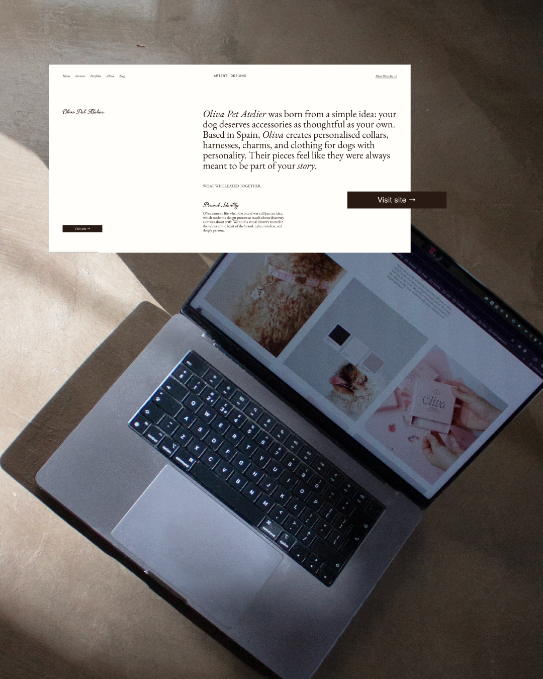
03. I added context to every portfolio piece. This one was big.
This is the one I see most often on other designers' sites (let’s not pretend I wasn’t doing it too lol).
Beautiful images. YES.
But no context, or explanation of the brief, the challenge, the creative thinking. Just a grid of stunning work with the client name underneath.
A portfolio without context is a gallery.
A portfolio with context is proof of expertise.
I added a short brief to every project: who the client was, what problem they came to me with, and what the work achieved. Suddenly my portfolio was a story about results.
This matters for SEO because it adds keyword-rich, relevant content to your site.
But more importantly, it matters for conversion since it helps potential clients see themselves in your work and understand what working with you actually looks like.
What to do: Go back to your portfolio and add 2-3 sentences of context to each project. What was the brief? What did you solve? What changed for the client?
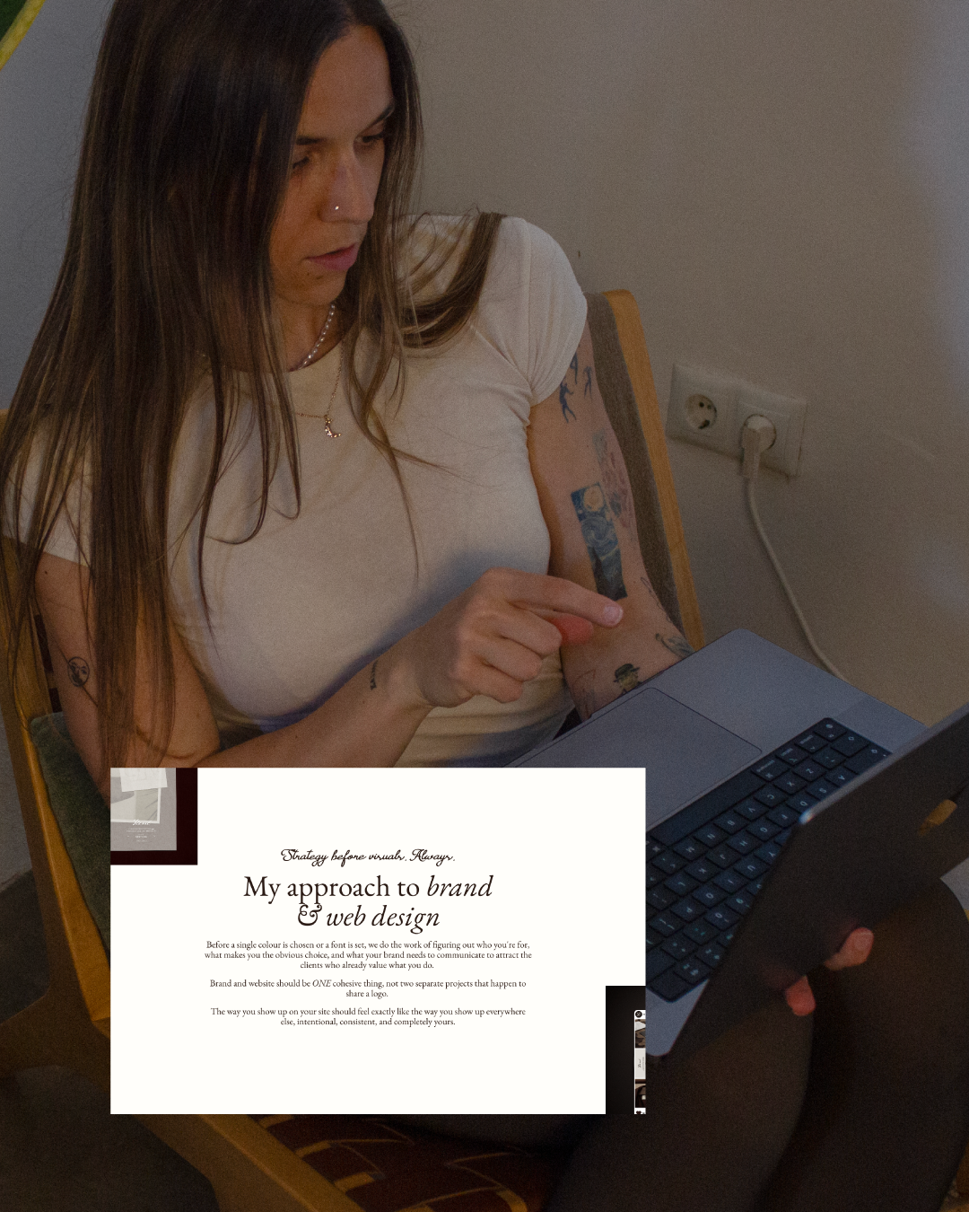
Not sure if your own site is set up to convert visitors into clients? This is exactly what I help women-led businesses fix (from SEO to the full visual identity.)
04. I rewrote my homepage to speak to one specific person
My old homepage tried to speak to everyone. Which means it spoke to no one.
Spoiler alter: completely forgettable. It could have been anyone. It spoke to no one in particular and that's exactly who it reached (holding my tears so bad).
The problem with trying to appeal to everyone is that it makes no one feel seen. And when someone doesn't feel seen on your homepage, they don't feel like you're the right fit for them. They move on.
I started by getting extremely specific about who my ideal client is. Not demographics, but the situation she's in, the frustrations she has, the thing she's trying to build, the fear sitting underneath the inquiry. Then I rewrote the homepage to speak directly to her.
I realised my hompeage didn't need to start with "Hi, I'm Marina." but "You've built something real but your website doesn't reflect it yet."
But: the version of her who's ready to build something that actually looks and feels like the business she's becoming.
Structure matters as much as the words. After rewriting the copy, I also rebuilt the flow:
Lead with her situation, not my credentials
Explain clearly what I do and how we'd work together
Place testimonials immediately after the offer, right when trust is still building, not buried at the bottom after she's already decided
When a homepage speaks to one specific person and structures itself around her journey, the right people feel it immediately. The wrong people self-select out.
Both outcomes are good.
What to do: Read your homepage out loud. Does it start with you or with your client? If it starts with you, flip it. Lead with their problem, then offer your solution.
05. I replaced polished copy with my actual voice
I'll be fully honest here… some of my copy had been touched by AI one too many times.
It was polished and professional but it could have been written by anyone.
I have a distinct way of speaking: direct, warm, honest, a bit silly, and lots of nonsense (because your girl ain’t a native).
My clients hire me partly because of how I communicate, not just what I produce. But my website copy was ironing all of that out in an attempt to sound more professional, which really just meant more anonymous (insert sad violin music).
Brand voice is how the right clients recognise you before they've even met you. It's what makes someone read your About page and think: yes, this is the person I want to work with because look at her cute dog Milka, how could I resist those puppy eyes?
When the copy could belong to any designer there's nothing to hold onto. Nothing that feels specific enough to trust.
I went back through and rewrote the sections that didn't sound like me. The ones that used phrases I'd never actually say out loud.
What to do: Read your copy out loud. Anything that makes you cringe or sounds stiff, rewrite it the way you'd actually say it to a friend.
06. I prioritised UX over aesthetics since it was costing me $$$$
I love a premium aesthetic (I meaaaaan I do this for a living). Animations that breathe, subtle transitions. A site that feels like entering a whole universe. Tactile experiences.
But I had crossed the line. I was looking at it with a designer's eye rather than a potential client's eye (and that my friend was costing me opportunities).
None of it feels premium to the person trying to read your page and decide whether to trust you. It just feels difficult.
And a site that's difficult to navigate is just expensive friction regardless of how beautiful it is.
I removed animations that looked beautiful but slowed down navigation. I increased font sizes. I improved colour contrast. I made sure the heading hierarchy made sense H1, then H2, then H3, so both Google and real humans could follow the page easily.
UX always comes first. That doesn't mean abandoning beauty (your girl could never design boring visuals). It means making sure beauty is working in service of the person on the other side of the screen.
What to do: Go through your site on mobile. Is everything easy to read? Is the navigation obvious? Are your CTAs visible without scrolling? Fix anything that creates friction.
None of these changes required a full redesign. No new branding, no new photography, no weeks of work. Just six focused improvements and +90% more views in seven days.
If your Squarespace website isn't attracting the clients your work deserves, let's change that.
I offer strategy-first branding + Squarespace websites built to convert fully done for you in 6 weeks. Every project includes full SEO setup, a website that converts, and a brand that positions you exactly where you want to be.